Responsive Design in 2026: Why Mobile Rules Web Development
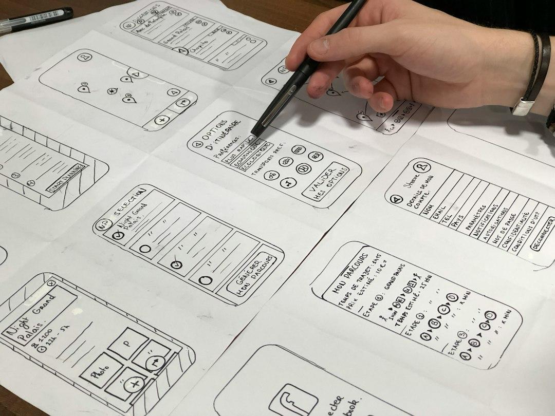
Over 73% of all web traffic now originates from smartphone devices. Browsing habits have fundamentally shifted, making a seamless mobile experience mandatory rather than optional. If your site fails to render instantaneously or requires manual zooming on a small display, potential customers will abandon your brand within seconds. Designing for small screens first is no longer just a technical best practice; it is the cornerstone of modern digital revenue generation.
At Companies Webs, we see firsthand how responsive architecture directly impacts search rankings, user retention, and sales pipelines. In 2026, mobile dominance is driven by advanced hardware, stricter search engine algorithms, and evolving consumer expectations. To stay competitive, your business must understand why the mobile experience leads web strategy and how to execute a modern responsive framework effectively.
The Evolution of Mobile-First Architecture in 2026
Responsive web design used to mean scaling down a desktop layout until it fit a smaller screen. That desktop-down approach is completely obsolete. Today, progressive enhancement dictates that engineers build the core layout for mobile touchscreens first, then layer on complex visuals for larger viewports.
Modern search engines penalize platforms that treat handheld devices as an afterthought. Mobile-first indexing evaluates your site's mobile performance as the primary baseline for search engine rankings. If your handheld layout displays slow-loading media, layout shifts, or hidden navigation, your visibility drops across all devices.
Furthermore, screen sizes have diversified dramatically. Web designers now build fluid layouts that adapt seamlessly across traditional smartphones, foldable displays, ultra-wide monitors, and tablet hybrids. Adapting to this variable landscape requires dynamic CSS units, fluid typography scale systems, and context-aware media queries.
Critical Technical Components of Next-Gen Responsive Design
Achieving true responsiveness goes far beyond dynamic page widths. To deliver a top-tier user experience on small screens, your technical stack must prioritize rendering speed and touch navigation.
Modern CSS Layout Engines
- CSS Grid and Subgrid: Allows developers to create complex, two-dimensional responsive layouts without writing bloated JavaScript code.
- Flexbox: Best suited for one-dimensional navigation bars, card stacks, and flexible alignment adjustments across changing viewports.
- Container Queries: Enables components to adapt intelligently based on the size of their parent container rather than the overall browser viewport width.
Performance Optimization and Asset Delivery
Speed remains critical for handheld performance. If your pages take longer than two seconds to load on a mobile network, your bounce rate triples. As detailed in our breakdown on why website speed directly drives your sales and conversions, raw loading performance directly dictates how well your traffic converts into paying clients.
To maximize performance on touch devices, implement these essential optimizations:
- Serve Next-Gen Image Formats: Convert standard media files into AVIF or WebP formats, reducing payload size by up to 80% without sacrificing visual quality.
- Utilize Responsive Image Attributes: Use srcset and sizes tags to ensure devices download only the image dimensions required for their specific screen resolution.
- Eliminate Cumulative Layout Shifts (CLS): Reserve explicit width and height aspect ratios for video players, images, and embedded widgets to prevent erratic page jumping during load times.
Touch-First User Experience and Interface Strategy
Designing for thumbs requires a fundamental shift in user experience strategy. Desktop interfaces rely on precise mouse cursors, whereas mobile interactions depend on thumb zones, gestures, and limited screen real estate.
Touch targets must measure at least 48x48 pixels to prevent accidental clicks. Navigation menus should transition from top horizontal bars to sticky bottom navigation docks or streamlined slide-out panels. Placing primary calls to action within natural thumb reach significantly increases overall interaction rates.
Typography also requires careful recalibration. Desktop font scales often look overwhelming or unreadable on small screens. Utilizing dynamic fluid typography ensures text scales smoothly between viewports, maintaining a comfortable reading height without awkward line breaks.
If you are evaluating whether your current digital infrastructure requires a targeted redesign or a full architectural overhaul, read our guide on custom web vs templates to see when to invest in each choice for long-term growth.
Practical Steps to Audit Your Mobile Presence
Optimizing your interface for 2026 requires systematic testing and continuous refinement. Execute this tactical audit to identify friction points across your mobile experience:
- Test Across Real Devices: Avoid relying exclusively on desktop browser developer tools. Test navigation, form fills, and checkout flows on physical iOS and Android hardware.
- Audit Interactive Elements: Check that buttons, form fields, and dropdown menus feature adequate spacing to prevent input errors.
- Streamline Mobile Data Entry: Replace lengthy multi-field forms with simple inputs, auto-fill capabilities, and native touch keyboards (e.g., triggering numeric keypads for phone fields).
- Review Media Auto-Play Settings: Ensure videos do not play automatically with sound or consume heavy bandwidth on cellular data connections.
Implementing these adjustments turns casual mobile visitors into engaged customers, directly expanding your brand reach and digital authority.
Scale Your Mobile Strategy with Companies Webs
Mobile devices govern modern online business interaction. Having a responsive design is no longer just a technical checkbox; it is your primary customer touchpoint. From custom interface layouts to lightning-fast performance optimization, your mobile infrastructure determines your digital conversion success.
Ready to transform your mobile experience into a predictable growth channel? Explore our tailored digital servicios or view our recent client success stories in our agency proyectos portfolio. Check out more strategic insights on our blog, or directly contacto our engineering team today to build a high-performing responsive platform.