Landing Page Anatomy: The Blueprint for High Conversions
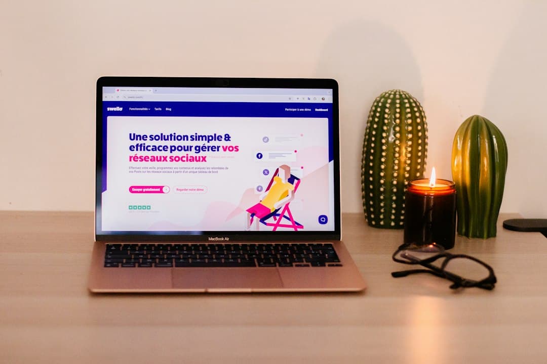
In digital marketing, traffic is only half the battle. You can run the most sophisticated ad campaigns on Google or Meta, but if your visitors land on a cluttered, confusing page, your budget goes to waste. A standard homepage introduces your brand, but a landing page has one single, hyper-focused mission: converting a visitor into a lead or a customer.
Building a high-converting landing page is not a matter of luck or artistic inspiration. It is a science. Every headline, button, image, and form field must occupy a strategic position to guide the user toward a single action. Let us dissect the exact anatomy of a high-converting landing page so you can audit your current pages and build your next campaigns for maximum ROI.
1. The Above-the-Fold Framework: Capturing Attention in 5 Seconds
The term "above the fold" refers to the portion of the webpage that is visible without scrolling. This is your digital storefront. If you do not hook your visitor here, they will bounce. Your above-the-fold area must contain three critical elements:
- The Unique Value Proposition (UVP): Your main headline must explain exactly what you offer, how it solves the user's pain point, and what makes you different. Keep it under 10 words. A great formula is: [Action Verb] + [Desirable Outcome] + [Without the Pain Point].
- The Supporting Subheadline: This is a brief sentence that expands on the headline, adding context and setting expectations.
- The Primary Call to Action (CTA): Your main button must be highly visible, contrasting in color, and feature action-oriented copy. Instead of "Submit" or "Click Here", use "Get My Free Audit" or "Start Saving Time Now".
If you want to see how these elements look in action, check out some of our recent digital projects where we have applied this exact structure to boost client conversions.
2. Visual Hierarchy and Hero Imagery
Humans process visual information 60,000 times faster than text. Your hero image or video should not just look pretty; it must show your product in action or depict the emotional state of your customer after using your service.
Avoid generic stock photography of people shaking hands. Use high-quality screenshots of your software, a short 30-second explainer video, or an authentic photograph of your team. Ensure the visual flow of the page directs the eye toward the CTA button. You can achieve this using directional cues, such as arrows or a person in the photo looking toward the form.
3. Social Proof: Building Trust Instantly
People do not buy what you say about yourself; they buy what others say about you. To overcome consumer skepticism, place social proof immediately below the fold.
- Client Logos: If you serve B2B clients, display a row of recognizable logos.
- Testimonials with Faces: Use 2 or 3 high-impact quotes. Always include the client's full name, job title, and a photo.
- Data and Trust Badges: Display ratings from platforms like G2, Capterra, or Trustpilot. If your service requires high security, show SSL certificates and compliance badges.
When designing these trust sections, remember that a fast, secure website is just as important as a glowing review. If you want to make sure your site meets the fundamental security standards that users expect, read our guide on Web Security for SMEs: The Absolute Minimum You Must Do to secure your lead capture forms.
4. The Benefits Section vs. Features
One of the most common mistakes in web design is listing features instead of benefits. Your users do not care about your product's technical specifications; they care about how your product makes their lives easier, richer, or more efficient.
Translate every feature into a concrete benefit:
- Feature: "Our software has 256-bit encryption."
- Benefit: "Your private client data remains 100% secure and hacker-proof."
- Feature: "10GB of cloud storage."
- Benefit: "Access all your design assets from any device, anywhere in the world."
Structure this section using a clean 3-column layout or alternating rows of text and imagery. Keep paragraphs short—no more than three lines—and use bullet points to make the content highly scannable.
5. The Lead Capture Form: Reducing Friction
Your form is the gateway to conversion. Every field you add to your form decreases your conversion rate. Ask only for the absolute minimum information you need to follow up with the lead. For a top-of-funnel lead magnet, a name and email address are enough. For a sales-ready demo, you might add company size and website URL.
If you must use a longer form, implement a multi-step form. Breaking 8 fields into two steps feels much less intimidating to the user than a single long form. Additionally, ensure your form is fully optimized for mobile devices, with large input fields and auto-fill enabled.
6. The Secondary CTA and Footer: Catching Scrollers
As users scroll down your page, they should never be more than one scroll away from a CTA. Repeat your primary CTA button at the very bottom of the page.
Keep your landing page footer minimal. Unlike a standard website footer, do not include links to your social media, about page, or other blog posts. These are exit points that distract the user from the main goal. The only links in your landing page footer should be your Privacy Policy and Terms of Service to remain compliant with GDPR.
Elevate Your Conversion Strategy
A high-converting landing page is a continuous process of testing, analyzing, and refining. If you are looking to build a custom landing page that turns cold traffic into loyal clients, explore our tailored web development services. We specialize in crafting lightning-fast, secure, and highly optimized web experiences.
Ready to scale your business? Read more actionable guides on our agency blog or reach out to our team today to discuss your next digital project.