Typography and Brand Personality: Selecting the Right Fonts
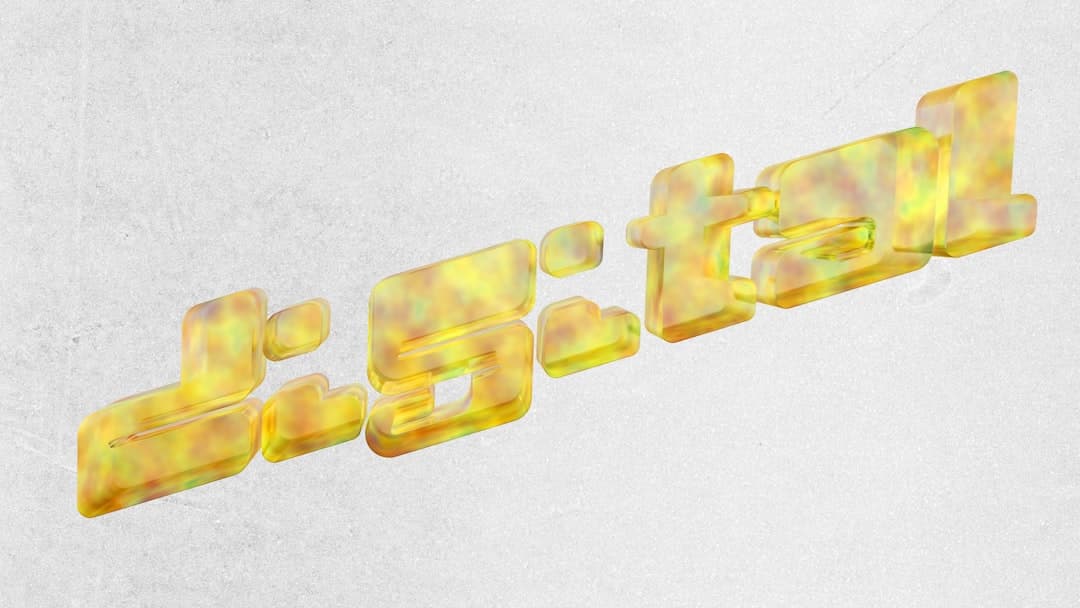
When you think about brand identity, your mind likely jumps to logos and color palettes. However, there is a silent partner working behind the scenes that holds immense power over how your business is perceived: typography. Every typeface you choose carries an emotional weight, whispers a specific tone, and shapes the user experience before a single word is actually read.
In digital design and corporate branding, fonts are not mere aesthetic choices. They are visual ambassadors. Choosing the wrong typeface can create a cognitive dissonance that drives potential customers away, while the right selection builds immediate trust and reinforces your market positioning. Let us explore how typography translates directly into brand personality and how you can make strategic choices for your business.
The Psychology Behind Font Families
To understand how typography influences perception, we must break down the primary font families and the psychological associations they trigger in the human brain.
Serif Fonts: Tradition, Trust, and Authority
Serif fonts feature small decorative strokes, or "feet," at the ends of their letters. Originating from traditional stone carving and print media, they convey history, reliability, and institutional trust.
- Emotional Associations: Respectable, reliable, formal, academic, and high-end.
- Best For: Law firms, financial institutions, editorial brands, and luxury heritage companies.
- Examples: Times New Roman, Georgia, Baskerville, and Playfair Display.
Sans-Serif Fonts: Modernity, Clarity, and Efficiency
Sans-serif fonts lack the decorative strokes of serifs, offering clean lines and geometric structures. They gained popularity during the modernist movement and have become the default choice for the digital age due to their high readability on screens.
- Emotional Associations: Clean, modern, approachable, objective, and forward-thinking.
- Best For: Tech startups, software companies, modern lifestyle brands, and businesses looking to showcase their work in our creative portfolio.
- Examples: Helvetica, Arial, Roboto, Montserrat, and Inter.
Slab Serif Fonts: Boldness, Stability, and Impact
Slab serifs feature thick, block-like serifs. They are designed to stand out and command attention, bridging the gap between traditional authority and modern industrial strength.
- Emotional Associations: Strong, confident, rugged, and masculine.
- Best For: Construction companies, outdoor gear brands, and creative agencies wanting to make a bold statement.
- Examples: Rockwell, Courier, and Clarendon.
Script and Display Fonts: Creativity and Distinct Personality
Script fonts mimic cursive handwriting, while display fonts are highly stylized typefaces designed strictly for large sizes, such as headings and logos.
- Emotional Associations: Elegant, creative, playful, unique, or rebellious.
- Best For: Artisanal brands, boutique hotels, children's products, or entertainment industries. They should be used sparingly to avoid legibility issues.
- Examples: Lobster, Pacifico, Great Vibes.
How to Align Typography with Your Brand Values
Selecting your typography should never be a matter of personal taste. It must be a strategic decision rooted in your brand's core values. If you have already defined your name using our Naming Guide: How to Choose a Brand Name Without Regret, the next step is ensuring your visual language matches that identity.
To align your typography with your brand personality, follow this structured process:
- Define your core personality traits: Choose three defining words for your brand (e.g., innovative, friendly, efficient or luxurious, exclusive, traditional).
- Analyze your target audience: A younger, tech-savvy audience expects clean, geometric sans-serifs, while a high-net-worth investor audience might respond better to elegant serifs.
- Prioritize legibility over trends: A trendy font that is difficult to read on a mobile device will ruin your user experience and damage your credibility.
- Limit your font pairing: Use a maximum of two, or occasionally three, fonts. A common best practice is using a distinctive font for headings and a highly readable, neutral font for body copy.
Implementing Typography in Your Brand Guidelines
Once you have selected your brand fonts, consistency is key. Without strict rules, your team might use different font weights, sizes, and styles across various platforms, diluting your brand identity.
This is where a brand manual becomes indispensable. To understand how to document these rules and protect your visual identity, read about What is a Brand Manual and How It Saves Your Business Money, which outlines the exact framework for setting up your typographic hierarchy.
Your brand manual must specify:
- The Primary Font: Used for main headings and titles.
- The Secondary Font: Used for body text, subheadings, and interface elements.
- Fallback Fonts: Standard system fonts (like Arial or Georgia) to be used when your custom fonts cannot load.
- Hierarchy Rules: Exact font sizes, line heights (leading), and letter-spacing (tracking) for digital and print formats.
Technical Considerations for Digital Performance
In the digital space, typography is not just about looks; it affects performance. Page load speed is a critical factor for both user experience and search engine optimization (SEO).
When we design custom platforms at Companies Webs, we optimize font delivery by limiting the number of font weights loaded. Loading five different weights of the same font family can significantly slow down your website. Stick to Regular, Medium, and Bold to keep your site fast and responsive. Always ensure your fonts are licensed correctly for web use to avoid legal complications.
Craft Your Brand's Visual Voice
Typography is the physical voice of your written content. It tells your audience how to feel about your messages before they even read them. Choosing the right typefaces requires a deep understanding of psychology, design principles, and technical performance.
If you want to define a strong, cohesive identity for your business, check out our tailored branding and development services or read more industry insights on our corporate blog. Ready to elevate your digital presence? Get in touch with the Companies Webs team today, and let us build a brand that truly resonates with your audience.