Color Psychology: Build a High-Converting Digital Brand
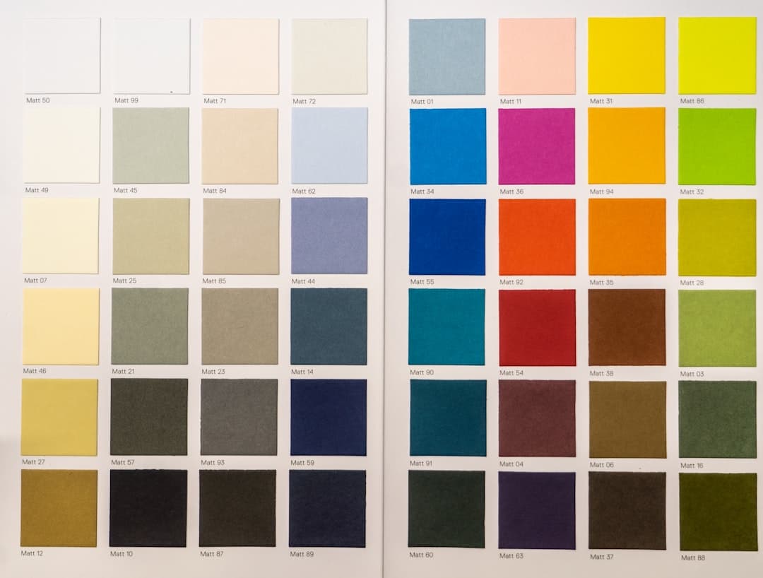
Every interaction a user has with your digital brand happens in a fraction of a second. Long before they read your copy, analyze your pricing, or navigate your menu, their brain has already formed an opinion about your business. This immediate, subconscious judgment is heavily driven by color. In the digital space, where physical touch is absent, color becomes your primary tool to convey emotion, establish trust, and guide user actions.
Applying color psychology to your digital brand is not about choosing your favorite shades. It is a strategic process that directly impacts user experience (UX), brand recall, and conversion rates. Whether you are launching a new startup or redesigning an existing platform, understanding how colors trigger specific psychological responses is essential to standing out in a crowded online marketplace.
The Science of Color and Digital Conversions
Research shows that up to 90% of snap judgments made about products can be based on color alone. In digital environments, this percentage is highly critical because users have lower attention spans and higher expectations. Color is the first element the human brain processes, meaning your brand's palette serves as an immediate visual shorthand for your values, industry authority, and professionalism.
When you strategically apply color psychology, you reduce the cognitive load on your users. For instance, using highly contrasting colors for your call-to-action (CTA) buttons creates a clear visual hierarchy, directing the eye exactly where you want it to go. This is not just theory; major digital platforms constantly test and optimize their color choices to maximize user engagement. If you want to see how we apply these principles to real-world businesses, you can browse our previous digital projects to see how color strategy translates into clean, high-performing user interfaces.
Decoding the Digital Color Spectrum
Different colors evoke distinct psychological responses. In digital branding, you must select a palette that aligns with your specific business goals and target audience. Here is a breakdown of how key colors function in the digital space:
- Blue (Trust, Security, and Professionalism): This is the most popular color for financial institutions, tech giants, and B2B platforms (e.g., PayPal, LinkedIn, Zoom). Blue projects stability and reliability, reducing the perceived risk of online transactions.
- Red (Urgency, Energy, and Excitement): Red physically stimulates the human body, raising the heart rate and creating a sense of urgency. It is highly effective for clearance sales, entertainment platforms (like Netflix), and food delivery apps.
- Green (Growth, Health, and Action): Associated with nature, wealth, and stability. Green is widely used by environmental brands, fintech startups promoting financial growth, and as a highly effective color for "Go" or "Success" actions in UX design.
- Black and Dark Grey (Luxury, Sophistication, and Power): Premium brands (like Apple or Squarespace) use minimalist dark palettes to convey exclusivity, high quality, and modern elegance.
- Orange and Yellow (Optimism, Friendliness, and Caution): These bright colors grab attention quickly. Orange is often used for playful, energetic brands or friendly CTAs (like Amazon's "Add to Cart" button), while yellow must be used sparingly to avoid eye strain.
A Practical Framework for Designing Your Digital Palette
To implement these psychological triggers effectively, you need a structured approach. You cannot simply pick three colors because they look good together on a mood board. Follow this step-by-step framework to build a high-converting digital color scheme:
1. Define Your Brand Persona First
Before looking at color wheels, list three to five core attributes of your business. Are you disruptive and bold, or traditional and secure? A cybersecurity firm needs a completely different psychological profile (blues, deep greys) than a creative marketing agency (vibrant oranges, purples).
2. Implement the 60-30-10 Rule
This classic design rule helps maintain visual balance on websites and mobile applications:
- 60% Dominant Color: This is your background or primary brand color. It sets the overall tone of your website. Usually, this is a neutral shade (white, light grey, or deep dark blue/black for dark mode).
- 30% Secondary Color: This color supports the dominant shade and is used for structural elements, sidebars, subheaders, and card backgrounds. It should create clean contrast with the dominant color.
- 10% Accent Color: This is your "conversion" color. It must be a highly contrasting, vibrant shade reserved exclusively for CTAs, key alerts, and interactive elements. If everything is colorful, nothing stands out.
3. Prioritize Accessibility and Contrast
A beautiful palette is useless if your audience cannot read your content. Digital brands must comply with Web Content Accessibility Guidelines (WCAG). Ensure your text-to-background contrast ratio is at least 4.5:1 for normal text. Tools like Coolors or Adobe Color can help you test contrast ratios before finalizing your palette.
Common Digital Color Mistakes to Avoid
Even experienced marketers fall into traps when applying color psychology to digital platforms. To ensure your brand remains professional and effective, avoid these critical mistakes:
- Ignoring Dark Mode Compatibility: Modern users expect dark mode options. If your primary brand colors do not contrast well against dark grey or black backgrounds, your user experience will suffer.
- Overcomplicating the Palette: Using too many colors dilutes your brand identity and confuses the user. Stick to one primary, one secondary, and one accent color.
- Neglecting Cultural Context: Colors do not mean the same thing everywhere. While white represents purity and minimalism in Western cultures, it is associated with mourning in parts of Asia. Always research your target demographic's cultural background.
Elevate Your Digital Brand Today
Applying color psychology is a powerful way to influence user perception, build immediate trust, and drive conversions without changing a single line of your copy. By selecting a cohesive, accessible, and strategically balanced palette, you give your digital product a distinct competitive edge.
If you are ready to transform your online presence with a scientifically backed visual identity, our team is here to help. Explore our comprehensive branding and design services to discover how we build cohesive digital experiences. To discuss your project and get custom recommendations for your brand, reach out to our team of experts today.